When it comes to email design, everyone seems to have a different take. Most people are all about plain text for that personal, stripped-down feel, while others swear by bold visuals and polished layouts. You’ll hear one group say “keep it minimal,” and another argue that “more images = more clicks.”
Some designers push for clean, mobile-first layouts, while others lean into motion and interactivity; like GIFs, animations, and swipeable content.
With so much debate, it’s easy to get lost in the noise. But here’s the truth: the best email designs are the ones that connect, convert, and keep your audience coming back. And in 2025, that means staying ahead of the curve with smart, user-focused design choices.
Let’s break down the top email design trends you need to know this year:
1. Interactive Emails Are Here to Stay
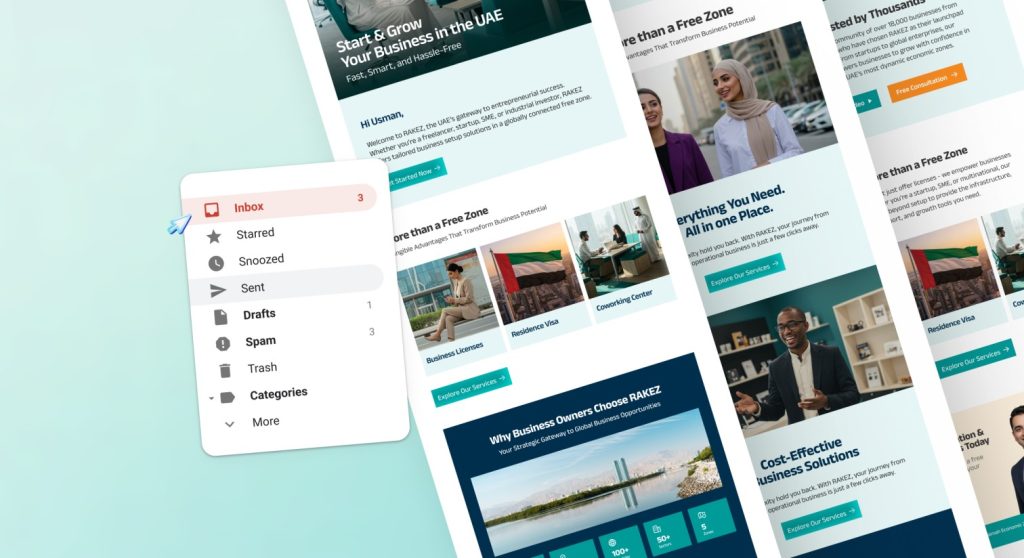
Interactive emails are no longer a gimmick; they’re expected. Features like hover effects, embedded videos, and tappable tabs keep users engaged right in their inbox.
Why it works:
- Boosts click-through rates
- Keeps readers engaged longer
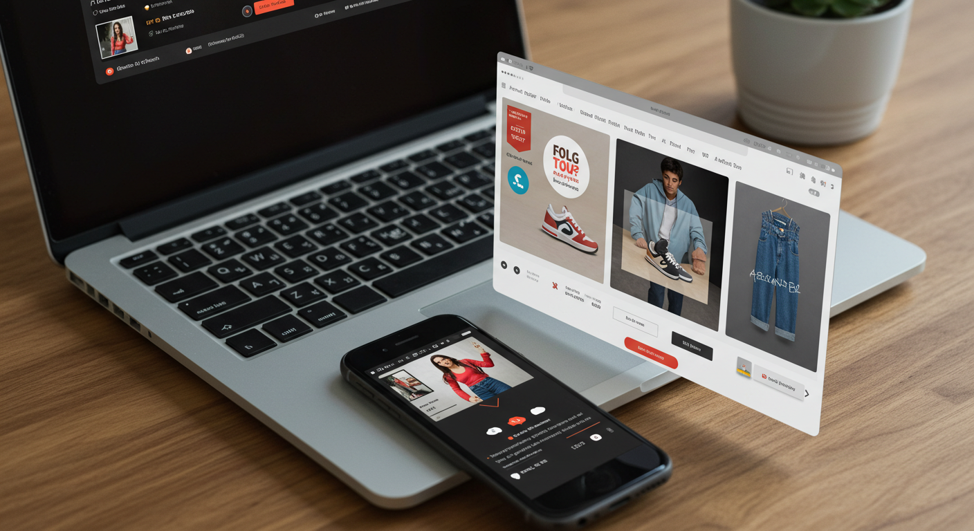
Imagine an e-commerce brand letting users swipe through product collections inside an email, like a carousel of shoes or outfits. That’s dope!
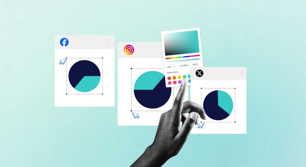
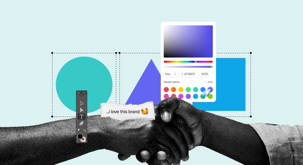
2. Minimalism + Bold Typography
Gone are the days of cluttered emails. In 2025, less is more; but with an edge. Clean, white space-heavy layouts combined with bold, oversized typography help important messages pop.
Pro tip:
Use bold fonts to emphasize CTAs or core messaging, and pair with a minimalist layout to keep it sharp and modern.
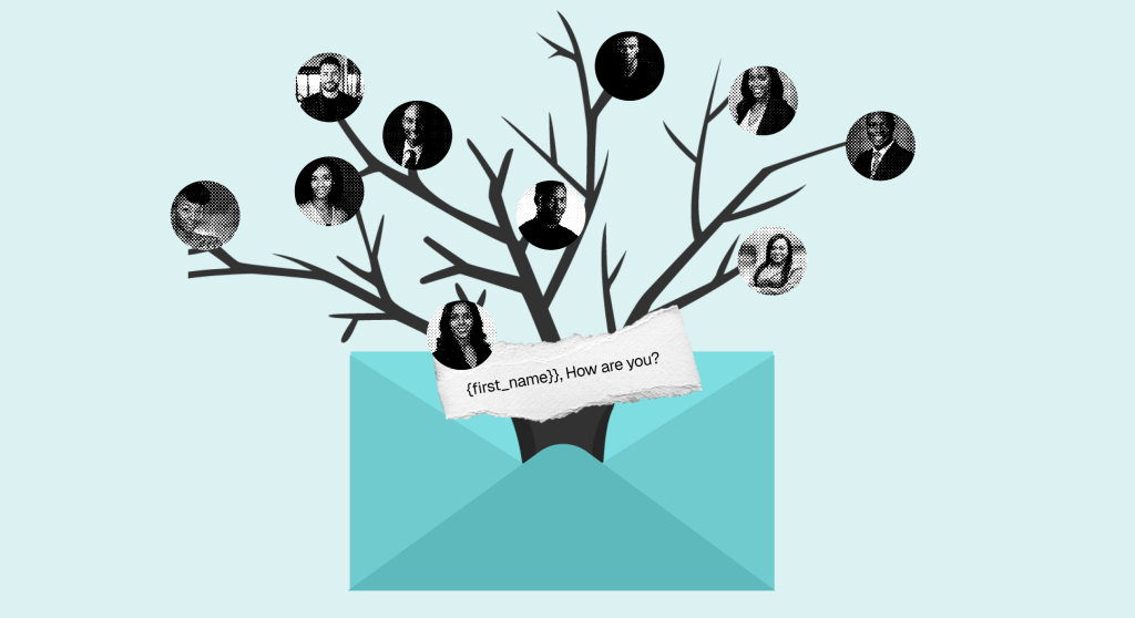
3. AI-Powered Personalization
It’s not just about adding a first name to the greeting anymore. Brands are using AI to personalize email content blocks, product recommendations, and even design layouts based on user data.
What it looks like in action:
- A customer who recently browsed jackets receives an email featuring only outerwear
- A user in Miami sees beach-ready products, while someone in NYC sees cozy layers
Bonus tip:
Use dynamic content modules in your ESP (Email Service Provider) to create segmented email experiences.
4. Dark Mode Optimization
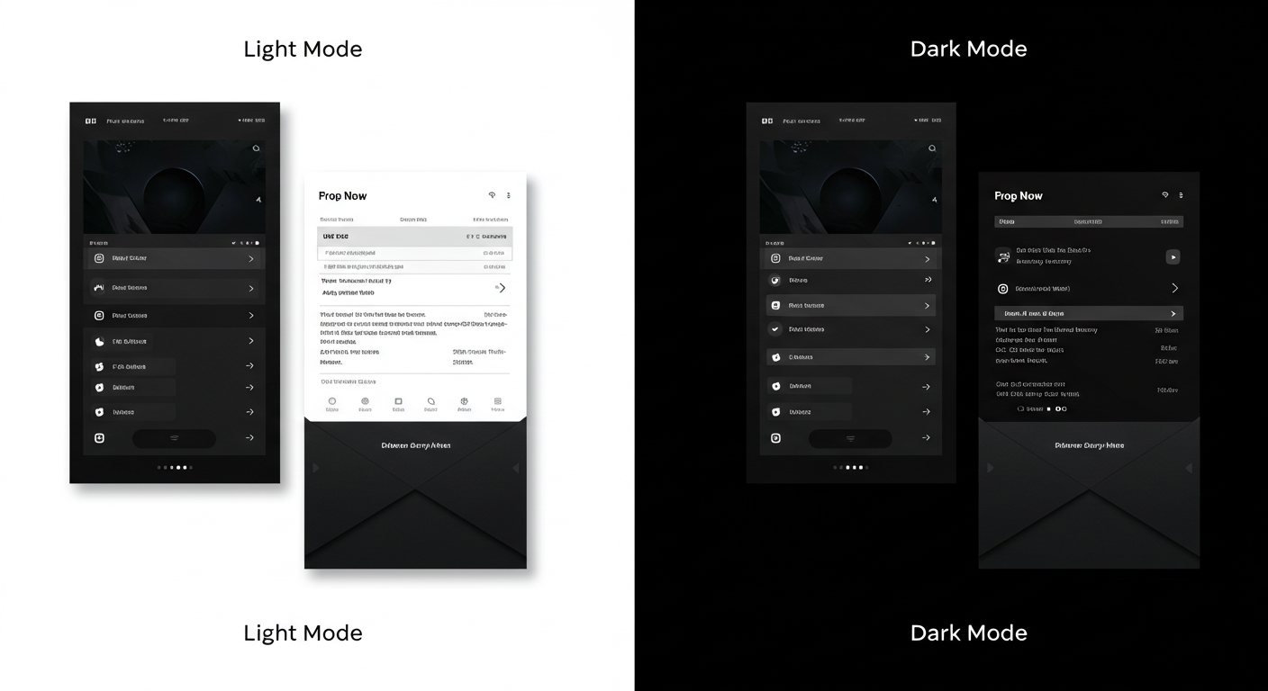
Dark mode is no longer optional; it’s essential. With more users opting for dark UI settings, emails must adapt to maintain readability and aesthetic appeal.
5. Mobile-First
With over 70% of email opens happening on mobile, designing for mobile isn’t just smart, it’s mandatory.
Best Practices:
- Large, tappable buttons
- One-column layouts
- Vertical stacking over side-by-side elements
- Short subject lines and preheaders that pack a punch
6. Micro-Animations & Subtle Motion
Micro-animations and subtle movement can elevate the email experience. Just don’t go overboard, less is more when it comes to motion.
Use GIFs for:
- Product demos
- Adding life to testimonials or stats
- Celebrating sales, launches, or announcements
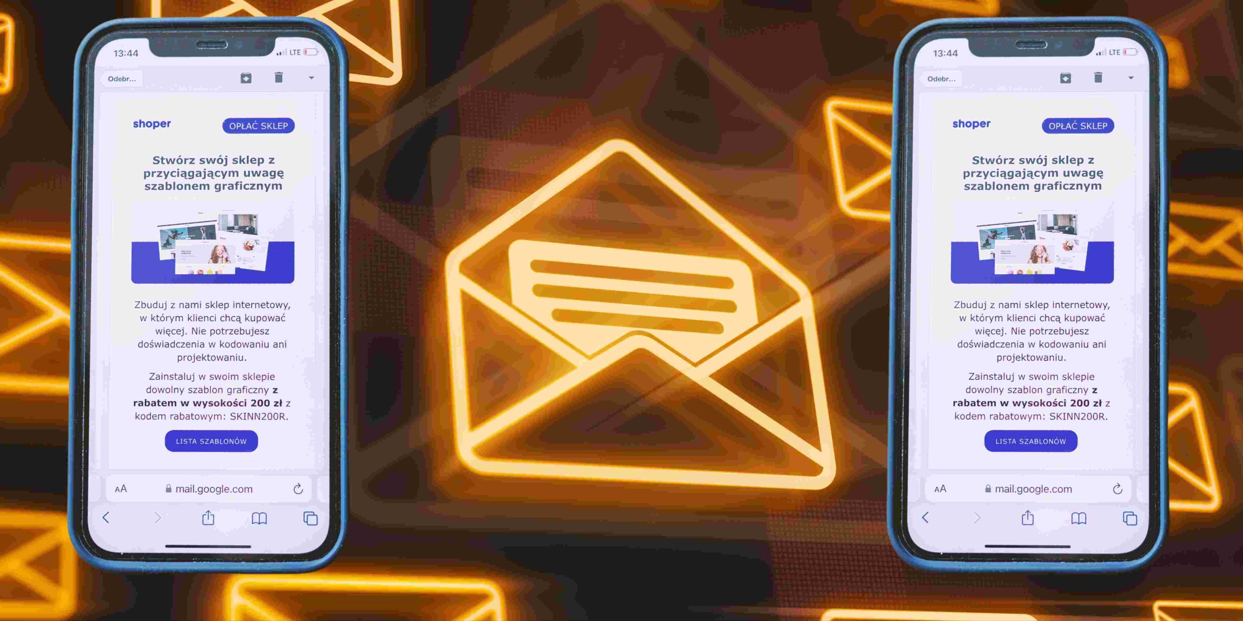
7. Nail the “Above the Fold” Content
In email design, above the fold refers to the part of the email that’s immediately visible when someone opens it, before they scroll. This is prime real estate, and what you place here can make or break your engagement.
Why it matters:
Most people spend just a few seconds scanning an email. If your key message, offer, or CTA isn’t front and center, you risk losing their attention.
Best practices:
- Place your main headline or offer near the top
- Include a clear, eye-catching CTA button
- Use strong visuals or bold typography to draw the eye
- Keep your value proposition crisp and compelling
Pro tip:
Design for mobile first. What’s “above the fold” on desktop may not be on a phone. Always preview on multiple devices.
Final Thoughts:
Are You Design-Ready for 2025?
The best email designs in 2025 balance functionality with beauty. Whether you’re aiming for high engagement, conversion, or brand loyalty, adopting these trends can give your emails the creative edge they need.
Need help creating scroll-stopping emails?
At margital360, we specialize in user-friendly, conversion-driven email design that doesn’t just follow trends, it generates revenue.